

Automating HR Leave and ADA Requests at Seattle IT
Seattle IT is launching a new series highlighting some of the innovative projects shaping how our department delivers services across the city. Each installment will offer a behind-the-scenes look at various teams’ work, the challenges they’re tackling, and the solutions they’re building to improve experience for staff and the communities we serve. First up, a short series with the Service Design Team on how they work to improve human resources processes for Seattle IT employees that ultimately lead to better services and more efficient workloads for team members.
Service Design is a human-centered methodology of understanding and organizing people, interactions, and processes to improve service quality and user experience for both employees and customers. By integrating customer experience principles with business processes, service design can help public sector agencies identify opportunities to reduce costs while also boosting engagement and customer satisfaction.
Seattle IT employees who need time away from work or an ADA accommodation should be supported by a process that is clear, consistent, and easy to navigate. However, with more than 600 employees in the City IT department and only two HR Business Partners (HRBPs) responsible for managing all Leave and ADA requests, this ideal experience was not always possible.
Defining the Problem
With requests arriving through emails, chat messages, and informal conversations, HRBPs lacked a centralized process for intake and tracking them. This resulted in:
- High administrative burden and repetitive communication for HR.
- Employee frustration and confusion with the process.
- Delays in collecting required documentation.
- Missed or lost paperwork due to inconsistent documentation paths.
It was clear that this process wasn’t sustainable for employees or HRBPs.
Early Prototype and Scoping the Consultation
To address this problem, Seattle IT’s Labor Relations lead, our primary stakeholder, built an early PowerApp prototype of a one-stop-shop portal to submit leave, ADA, and recertification requests that were all captured in a centralized SharePoint list. The Service Design team was brought in to evaluate this prototype, validate it with real employees to ensure that this was the right self-service solution, and recommend improvements to the user experience.
What We Found First: The Heuristic Evaluation
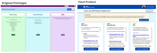
Our first step was to work with the primary stakeholder to conduct a heuristic evaluation—auditing the prototype with a usability checklist to help us quickly identify where it might confuse users or break expected design conventions. The evaluation revealed several major areas for improvement:
Visual Consistency and Branding
The prototype did not adhere to the City of Seattle’s Digital Style Guide, using incorrect colors and font styles as well as missing the logo and common layout elements that help employees recognize legitimate City digital tools. The pages of the portal were not optimized for different screen sizes and had too much whitespace, making the interface feel visually disproportionate and created barriers for users relying on accessible, adaptable interfaces.
Navigation
The portal lacked essential navigation features, preventing users from moving between screens or restarting the request process. Buttons on the home page didn’t appropriately convey what would happen when clicked, and the request forms were difficult to navigate since they didn’t follow common digital form practices.
The heuristic evaluation findings directly informed our priorities in redesigning the portal to be more user-friendly.
Testing the Prototype with Users
Our next step was to test this prototype with actual users in IT to understand how they expected to interact with the portal as well as what features and information they needed when learning about and requesting different types of leave. We conducted five moderated usability tests with participants across IT who had varying levels of experience with Leave/ADA requests.
During each usability test, we:
- Asked each participant to discuss their familiarity with the existing request process.
- Guided the participant through two scenarios of requesting leave and recertifying a leave request. We asked them to speak their thoughts aloud and describe their expectations during those flows.
- Asked the participant to rate their confidence in requesting and recertifying leave requests without any direct HR assistance.
Key Usability Issues and How We Addressed Them
What Users Found: Portal and form usability gaps
Users missed key elements of the request form such as the Employee Number field, date selections, required documentation links, and disclaimers because they were hard to find or understand. They needed clearer field-level guidance and easier navigation between pages.
“I think the wording [of the required documentation link] might be just a little bit confusing because it’s saying I would have to save the link, but it’s not saying that I would have to submit this information at a later date.” – Manager
How We Addressed It:
- Implemented a ‘back button’ by linking the application logo to the home page, allowing users to easily restart navigation from anywhere in the portal.
- Improved usability by applying common form-design practices: stacking fields vertically, pre-filling basic information, dynamically adjusting the “Care For” dropdown based on the selected leave type, preventing users from submitting the form until all required fields are complete.
- Redesigned the required documentation component, preventing users from checking “Confirm” until they open the documentation link.
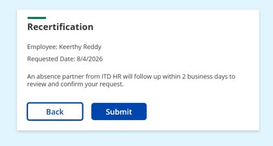
What Users Found: Unclear recertification expectations
Users were unsure whether their recertification was completed correctly or which leave request was recertified because the request was submitted automatically from the home page rather than through a structured form like the other request types.
“I was expecting a form because I don’t know what I submitted just now… I’m a little unsure like what that action really did.” – Business Systems Analyst
“I did something wrong… I would imagine I would have to put some information in about how I need to extend my leave… It feels like I skipped a step… Should I start a new request? Is it a new request to extend?” – Manager
How We Addressed It:
- Added an extra step to the recertification process that confirmed the employee’s name, date of the recertification request.
- Provided users with clear next steps and a confirmation message to reassure them that the process was completed correctly.
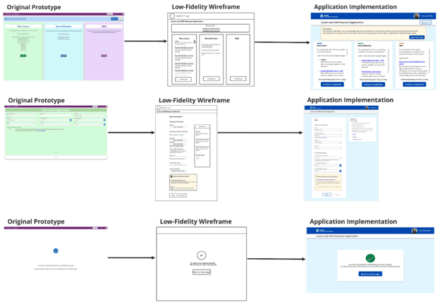
We took direct inspiration from themes and insights from our testers’ experiences, reactions, and suggestions to the prototype to sketch new design ideas for the portal with the stakeholders.
Designing and Implementing the Final Product
With the launch date of the portal approaching quickly, our team’s project lead consolidated all the research insights and prioritized features from the sketching sessions to create low-fidelity wireframes. As the stakeholders didn’t have the capacity to implement the designs, a team member with technical expertise stepped in to take over development. Despite challenges such as learning to develop with Power Platform for the first time and working around its limitations, the team delivered a redesigned, fully functioning portal through strong collaboration with each other and with stakeholders.
End-To-End Service Improvements
Our user research revealed opportunities to enhance both the pre-service and post-service experiences of the portal.
SharePoint Entry Page Upgrade
Users first access the portal through a SharePoint entry page, and our research showed that this entry point was unclear and not easily visible. In response, we refined the language to better highlight the portal’s functionalities and updated the image to reflect the portal’s purpose without overlapping text.
Enhanced Email Automations
After users submit a request through the portal, they receive automated confirmation and reminder emails. We improved these emails by adding links to required documentation, Leave/ADA coverage end dates and high-priority indicators. We also introduced additional reminders for managers when a direct report has outstanding documentation or when their coverage is nearing its end.
Next Steps
Since launching the portal, HRBPs supporting Leave and ADA requests for IT staff have reported a significant reduction in emails from employees seeking help with the process or trying to submit requests via email. Instead of creating their own guidance, managers now direct employees to the portal for information and to submit requests, and nearly all IT staff have incorporated it into their standard processes.
Our team worked with the stakeholders to design a feedback form embedded in both the portal and automated emails, giving users a channel to share input on the new request process and inform future iterations of the portal.
Seattle IT is committed to delivering reliable, secure, and innovative technology services that support City staff and strengthen the way we serve Seattle residents. Seattle IT includes the Service Design team. To learn more about their work, visit their webpage. Seattle IT also includes the Seattle Channel and the Technology Matching Fund Grant program, and digital equity programs including reduced-cost cable and internet opportunities. Visit www.seattle.gov/tech to learn about upcoming grant opportunities and to sign up for our newsletter.
Keerthy Reddy is an AI and Emerging Technologies Fellow working with Seattle IT through the NobleReach Scholars program. She is a member of the Service Design team and works with other teams and departments to support AI pilots and responsible adoption efforts across the city.
Legal Disclaimer:
EIN Presswire provides this news content "as is" without warranty of any kind. We do not accept any responsibility or liability for the accuracy, content, images, videos, licenses, completeness, legality, or reliability of the information contained in this article. If you have any complaints or copyright issues related to this article, kindly contact the author above.
